Sylvester Stallone’s The Expendables 3 is poised for a big weekend at the box office, but it’s already won the poster battle. It features the entire cast in a row, shoulder to shoulder, huge grins on their faces. Its tagline should be, “Look at all of us! You know this is going to be ridiculously fun!” Action fans are no doubt pumped at the sight of it. But what about the pros? We tapped Chad Maker, founder of Agency 71 Inc., a Toronto-based entertainment marketing firm that has designed more than 100 movie posters, to give us a fully locked and loaded critique.
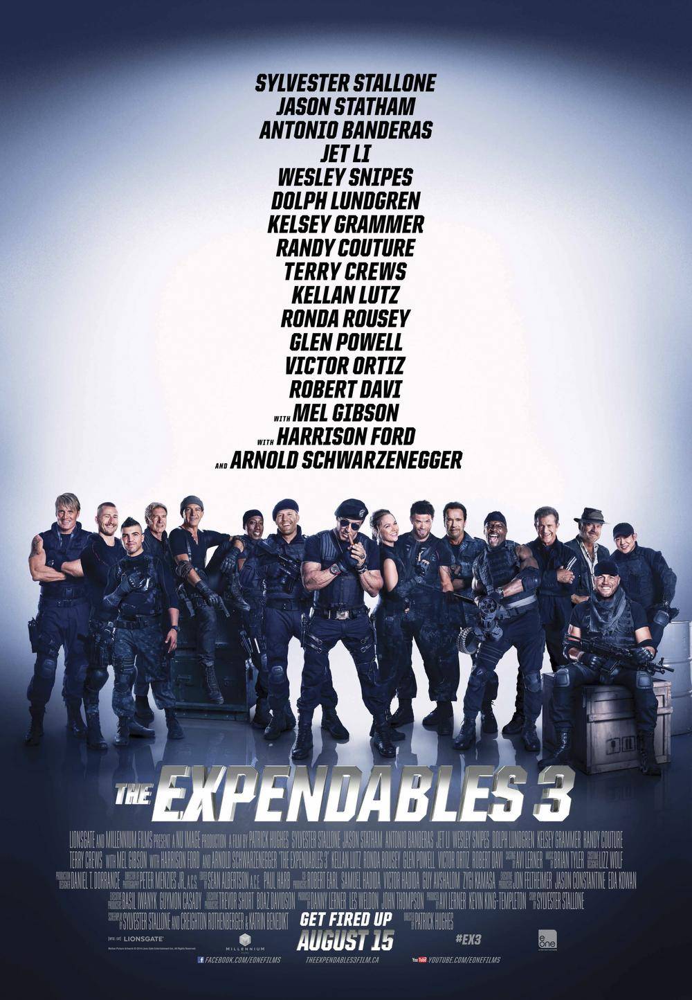
“The first thing I thought was, man, what a nightmare of managing who has priority where, position, in front of who, that type of thing,” Maker says. Every actor’s manager was no doubt fighting to get their client close to Sly. “I couldn’t imagine trying to fit that many people into a poster,” Maker says.
Stylistically, it doesn’t matter that the poster doesn’t even bother hinting at anything resembling a story or plot. “It hits their demographic in the sense that, ‘We’re a big gang of people and we’re going to go shoot the crap out of everything.’ They’re not selling that movie in any other way,” Maker says.
But the poster has its flaws. For one, with all the names listed vertically, there’s a lot of blank space, Maker says. For another, it doesn’t bear close scrutiny. “Everybody looks pretty plastic. I’m sure this was not a single shoot in one room all together,” he says. “It’s clearly heavily Photoshopped.”
But this isn’t a movie designed for close scrutiny. You have about 10 seconds to grab someone’s attention as a poster designer, Maker says. And this one does that, with the names and the brand and the huge cast all front and centre, Maker says.
“They’re not trying to pull any punches,” he says.
MAKER’S FAVOURITES
We also asked Maker what his favourite action-movie posters of all time are. These are the pro’s picks.
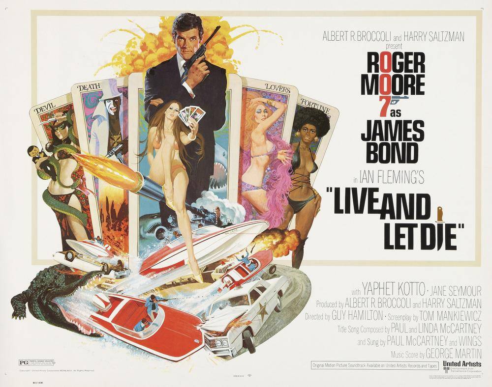
Live and Let Die (1973)
“I like retro posters, especially the James Bond ones, although there is a cheese factor to them. This one set the bar. It’s got so much stuff going on. At the bottom, it looks like a boat’s shooting out of a crocodile’s mouth. For action, you can’t really beat that.”
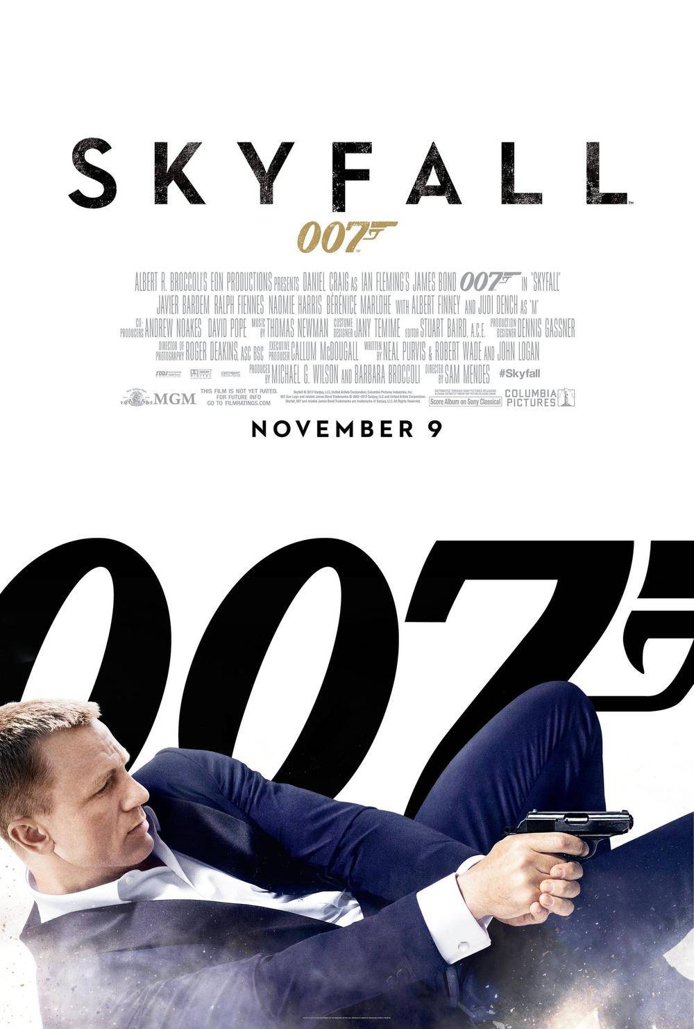
Skyfall (2012)
“It’s really graphically interesting. The first time I saw it was on the side of a bus, and he was the whole side of the bus. I was like, ‘That is really cool.’ ”
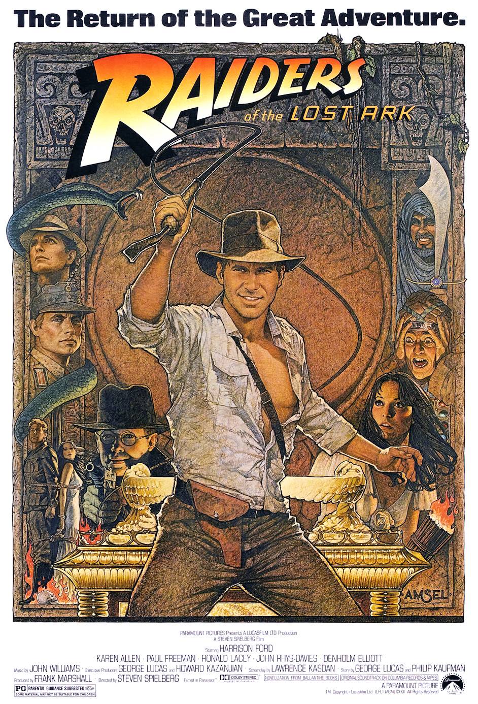
Raiders of the Lost Ark (1981)
“As a kid, I would look at that and try to find all the little details in there because it tells a bit about the story. But then, every kid looked at that and thought, ‘I want to be Indiana Jones.’ ”
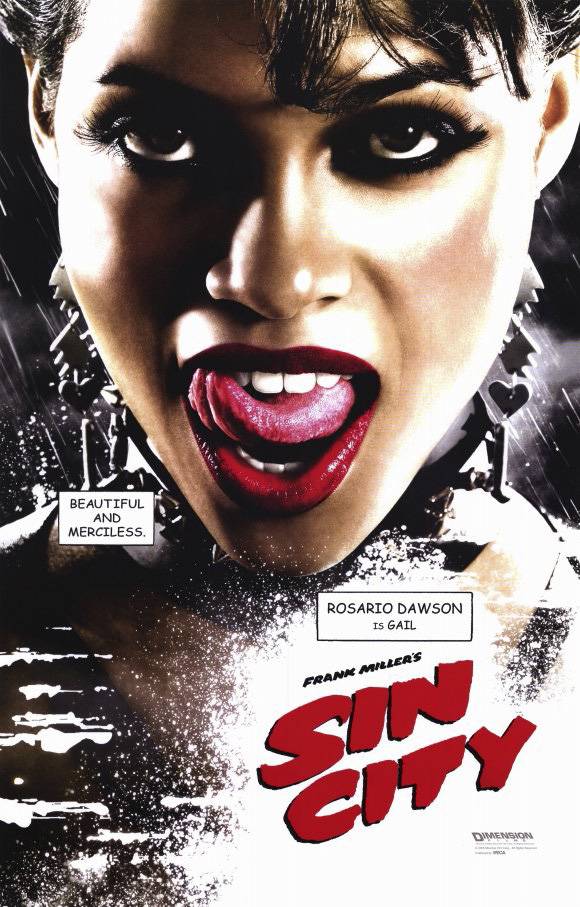
Sin City (2005)
“It was just so iconic and graphically so strong that it really caught everyone’s attention. It had that graphic-novel feel. I think they really kick-started that trend of doing the individual character posters.”