The Centennial Symbol of Canada, 1967
Greg Durrell photo
'Growing up in Canada I was inspired by its incredible design," says Vancouver graphic designer Greg Durrell. But he's also been frustrated by how little Canadian design has been celebrated over the years: There are no books, no museum retrospectives, nothing.
It's a shame, really, when you consider the wealth of logos and images, from the National Film Board eye to the ketchup-red maple leaf, that have helped inspire and shape who we are. So last week, Durrell launched a Kickstarter campaign to help fund a documentary he has in the works, Design Canada. He spoke to The Globe and Mail about why we as a country don't celebrate homegrown design as much as we could.
Co-designer James Valkus with the original sketch of the CN logo, 1960
Lorne Perry photo
I can't believe there aren't any books on Canadian design. That can't be true.
There are a few small things here and there. I put together a career retrospective of Burton Kramer, the CBC logo designer, about five years ago. There are some books that are about just logos that are literally 1,000 logos with no description. But nobody's really examined what these symbols mean and how they've impacted our identity.
The CN logo marks the first instance of a major national corporation designing an identity program.
Lorne Perry photo
To some people, the term "Canadian design" is probably like "Canadian cuisine" – what even is that? What makes it distinct?
The reality of Canada is that what makes this a beautiful country is that we are a country made up of many different countries, of many different cultures and backgrounds. It's really hard to define what a Canadian design is, but what we can talk about, and is true, is how design has impacted Canada and how it has really helped make us who we are as a nation.
Lorne Perry, former design manager, stands in front of the CN logo, designed by Allan Fleming and James Valkus.
Lorne Perry photo
Your film is going to focus largely on the 1960s. What made that the golden age for Canadian design?
When you look at Canada as a nation coming into the 1960s, there was this new-found sense of national pride. You had that new sense of pride, the rise of modernist style all around the world and a pretty serious social and political crisis in Canada at the time. There was a really strong need to unite Canada. One of the ways of doing that, I believe, was the flag. The maple leaf became this symbol that unites us all.
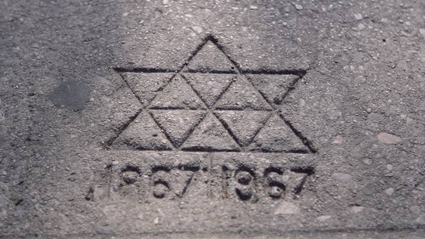
The Centennial Symbol of Canada was designed at the time when there were 10 provinces, plus the Territories. This maple leaf is made up of 11 elements (including the stem).
Greg Durrell photo
What is your favourite example of Canadian design from that period?
My favourite piece of Canadian design – and really, when you look back is the one that starts it all – is the Canadian National Railways logo in 1960. CN was trying to upgrade and modernize in the 1950s. They knew they needed to change their image. They come up with this sleek, clean logo. It's a single-thickness line, it's two letters that are connected together and inherently expresses everything the company does, symbolizing the movement of people, materials and messages from one point to another. Not only does Canada notice, but the entire world notices.
The Centennial Symbol of Canada is a symbol of unity.
Greg Durrell photo
You got to interview design legend Massimo Vignelli for the doc before he died. He raved about that logo.
He knew it all. There was one moment where he asked for a piece of paper and he started drawing the logo and breaking down what he loves about it. It really made me realize I was totally on to something.
Stuart Ash, designer of the Centennial Symbol of Canada
Greg Durrell photo
You've teamed up with filmmakers Jessica Edwards and Gary Hustwit, who made the documentary Helvetica. How did that partnership come about?
I knew that I couldn't do this on my own. … Gary has created the most successful design documentaries of all time, in my opinion. Helvetica showed me you could make a niche film about design, yet have it be accessible. I was put in touch with them through a mutual friend. They've been incredibly supportive.
The Centennial Symbol of Canada
Greg Durrell photo
Why don't we celebrate Canadian design, and why should we?
We are an extremely large country but our population is small, so we don't have the same media machine as other places in the world. And Canadians tend to be humble people. As a result , I think we maybe don't support our heroes as much as we should.
“A picture may say more than a thousand words. Two words, however, sometimes say more than a picture.” Anti-separatist poster design by Ernst Roch.
Greg Durrell photo
Why do I love the Montreal Expos logo even though it didn't make sense to me for the longest time?
I'm with you. I never got it as a kid either. But it was still so beautiful.
This interview has been condensed and edited.