
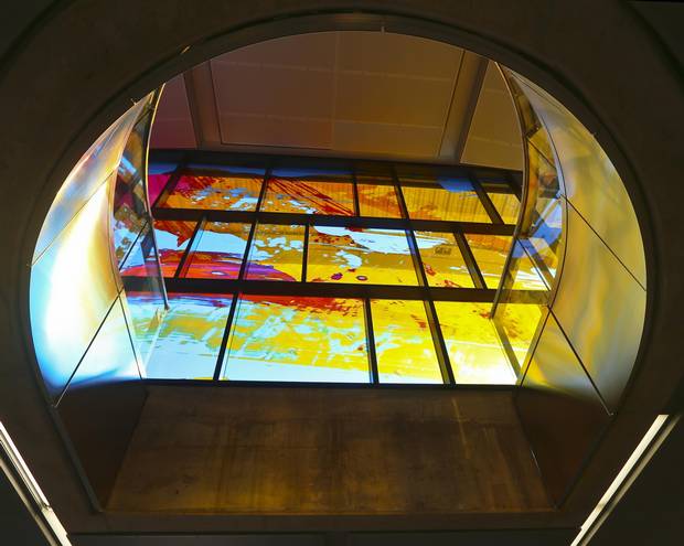
Looking up from the subway platform of the new Highway 407 station, still under construction, multicoloured, tinted sunlight shimmers and reflects down toward the platform floor.
The sight of filtered sunlight from on high, through the almost-ecclesiastical glass panels created by Toronto artist David Pearl, feels miraculous. Any glimpse of sunlight on a subway platform feels godsent.
This has been the Toronto Transit Commission's plan for nearly a decade, to make the six new stations that will extend Line 1 northward into something that makes passengers a little happier to be alive, rather than stuck in the drudgery of daily commuting.
Due to open toward the end of the year, three stations were recently finished enough for a hard-hat tour. All six were designed with an attention to aesthetic flourishes, by marrying artists with architects in the earliest phases of planning (albeit through an achingly drawn-out process of asking interested artists to submit their qualifications and proposals).
The whole idea was to make each of them a showpiece, with artwork incorporated directly into the construction. So, if a station is designed around natural light, have those windows become works of art. If it has a prominent ceiling, turn the ceiling itself into art.
Ian Trites, architectural supervisor for the TTC, rejects the argument that stations could be more cost-efficient without adornments. "If you're not building buildings for people to actually use and want to use, then you're defeating the purpose." He noted, for instance, how Victoria Park station on Line 2 on the east side of the city saw a marked decrease in crime after it was renovated with welcoming touches.

The budget for the artwork of each station is roughly 1 per cent of the cost of the stations’ public-facing structures.
"It depends on how you measure cost effectiveness. In the long term, when you integrate art and architecture, the community takes ownership of the station. You get less vandalism. You get more people that respect it. It's their station. So, it's less maintenance," he said.
The budget for the artwork of each station is roughly 1 per cent of the cost of the stations' public-facing structures. That works out to roughly $500,000 on average per station, Mr. Trites said. The overall budget, for instance, for Highway 407 station is $140-million. The TTC added that each station's costs vary, depending on its different facilities, such as bus terminals, etc.
Outside, the 407 station sprawls over the flat, north Toronto terrain, its arms reaching toward parking lots for park-and-ride passengers and connecting stops for buses. It looks like those tabletop starfish devices used for office conference calls.
But inside rests the true marvel. While touring the station, the midday sun streamed through Mr. Pearl's windows with their massive, abstract splotches of colour. It's a rare pleasure to want to linger in a subway station, to just stand there absorbing the interior light.
This attention to aesthetics, with daylight penetrating down as far as possible, was the TTC's aim as far back as September, 2009.
"And here's the beauty of it," said art consultant Brad Golden, who helped the process of matching artists with architects. "Unlike artwork that you shove in a corner because you have to deliver art [to satisfy a mandate], this skylight and this artwork in that location was designed right from the beginning," in the initial stages of design.

All six stations were designed with an attention to aesthetic flourishes, by marrying artists with architects in the earliest phases of planning.
Pioneer Village station one stop south could have a similarly mesmerizing effect, but in a very different and possibly controversial way.
A long row of giant LED-style light units will be hung from the station's ceiling, like the display of a huge calculator. Imagine if Texas Instruments made chandeliers, and you get a sense.
The digital units will run the length of the platform, strung in a line. Waiting passengers will be able to type letters, numbers, possibly whole messages using touch screens placed along the platform.
The obvious question is, what if someone types something crude or rude and it flashes across the entire platform?
"That's what the whole artwork is about. It's about information in public space, and how we deal with information and messages," said artist Jan Edler of Berlin-based Realities United, which designed the work. The firm specializes in public art installations, often enormous, light-based works on the façades of buildings.
The idea, Mr. Edler said, is that the words can be immediately changed by other passengers at different touchscreens. It'll be a test of how passengers communicate with each other, he said. The sculptural, LED-like units will also be computer regulated to emit consistent light, since they also provide lighting for the subway platform. Both the artist and the TTC hinted that although the interactive element is the whole point of the piece, there are alternative ways in which the lights could be used if they are abused.
The idea was to make each station a showpiece, with artwork incorporated directly into the construction.
Meanwhile, at the end of the Spadina extension, Toronto-based Paul Raff Studio has transformed the ceiling of the new Vaughan Metropolitan Centre station into a display of mirrored panels and windows overhead, creating a kind of soaring, kaleidoscopic sundial. Like Highway 407 station, the emphasis is on making the ascent from the subway platform feel inspiring, rather than feel like drudgery.
A subtler work though is Toronto artist Panya Clark Espinal's large-scale optical illusions located in various spots inside Downsview Park station.
The artist uses large, dark black lines, like massive brush strokes across the floor, walls and ceiling, but that are actually carefully laid into the building's interior tiles.
At various spots inside the station, the lines create perfect rings. Move a foot or two in any direction, and the illusion is lost.
"It's very challenging for artists to work in this context," Ms. Clark Espinal said. With all the engineering considerations, the differences between what the original conceptual architects had in mind and how the local architects put that into place, to say nothing of the bureaucratic process, "it requires a lot of patience on the part of the artist."
Her artwork in the station looks as though it was drawn, but it actually had to be painstakingly modelled to test the desired illusion. And below, at the platform level, there are two support columns with much smaller black rings and a reflective, rotating ball nestled between them, like a pearl placed deep below for passengers to discover. It has an almost sensual element to it.
When future archeologists dig up the detritus of our civilization, they won't care about the wreckage of subway signs and turnstiles. It'll be Ms. Clark Espinal's work that they'll ponder and marvel at.