
162 Colin Ave., Toronto.Yianni Tong Photography
The listing: 162 Colin Ave.
Asking Price: $2,685,000
Taxes: $8,432.00 (2018)
Lot Size: 30 X 110 ft.
Agent: Dimitrios Tsotos (Sage Real Estate Ltd.)
The back story
For architects Winda Lau and Andrea Yeatman, creating a residence that matches smooth family operations with singular design is an intriguing challenge.
Studio Lau – the Toronto-based practice Ms. Lau established in 2012 – has taken on spaces ranging from an eyewear boutique to a cooking studio, but the two consider residential design their forte.
“We both love getting into the details. It’s different every time,” Ms. Lau says.
Earlier this year, Ms. Lau and Ms. Yeatman decided to see where their creativity would take them if they were working without the constraints of a client’s wish list.
They found the raw material they were looking for at 162 Colin Ave. in the form of a traditional Toronto four-bedroom home with a 1980s addition.
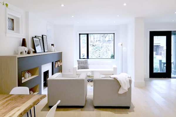
The house had charming details such as leaded glass windows and wood trim, but the transition from the original house to the newer addition was awkward. The kitchen and family room that had been tacked on at the rear seemed pokey and dark.
The house seemed like a solid candidate for an infusion of fresh light and contemporary design. The property’s address in the coveted Chaplin Estates near Yonge Street and Eglinton Avenue also appealed to the pair, who envisioned a young family moving into the home.
“Our big stance was that we wanted it to be warm and appealing and feel like a home,” Ms. Yeatman says.
The house seemed like a solid candidate for an infusion of fresh light and contemporary design.Yianni Tong Photography
The house today
Ms. Lau and Ms. Yeatman launched into the renovation as soon as they took possession of the house in March. Seven months later, they were placing furniture and hanging art.
A narrow hallway that led from the entrance to the kitchen was demolished in order to create a bright and open front entry with a large coat closet and powder room. The walls and doorways that made the main floor feel enclosed were torn out to make the main floor open and bright.
The solid front door with two sidelights was replaced with a glass door and one sidelight. The architects say the asymmetry feels more contemporary.
“The house itself is very symmetrical and wanted to modernize it,” Ms. Lau says.
New windows were framed in black to make them pop against the white walls. The old living room window and its muntin bars were replaced with a new picture window.
“It’s actually the same size opening but it’s so much more generous,” Ms. Lau says. “We like to make the windows an architectural feature.”
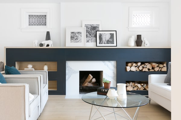
The architects say they had lots of debate around which original details to keep and which to replace.Yianni Tong Photography
The two say they had lots of debate around which original details to keep and which to replace, and where to do away with the old wood trim.
“Once you start pulling a thread, it might keep going,” Ms. Lau says.
But they had no such deliberations in the dining area, where a built-in bench rests under the original leaded windows with clear glass.
“We wanted to frame the dining room around these windows,” Ms. Yeatman says.
The transition from the dining area to the kitchen was smoothed with a new configuration.
“It’s nice when you have these little moments that direct flow through the house,” Ms. Lau says.
The architects also re-arranged the kitchen to make better use of the space. A doorway was closed in to provide a wall of white built-in appliances that include a refrigerator and wall ovens. Leftover spaces were put to use for pull-out shelving, wine storage and a nook for small appliances.
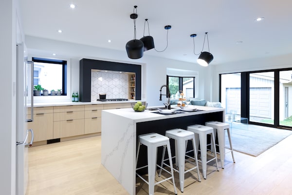
The use of black provides colour-blocking.Yianni Tong Photography
Contrast is provided by the island, which is black, with a built-in dishwasher, also in black.
“There’s some colour blocking going on,” Ms. Yeatman says.
Since they were removing walls, Ms. Lau and Ms. Yeatman added structural support with a sturdy post, then designed the cooking area to disguise it.
The result is an alcove that adds visual interest with a graphic tile surround and a built-in area for oils and spices.
“That’s part of the fun for us,” Ms. Lau says. “We had a structural wall – how do we make it beautiful and how do we make it functional?”
Full-height doors along another wall hide the pantry. Tucked in beside is the built-in desk and plenty of outlets for charging laptops and phones.
Ms. Lau says her own home life has taught her the importance of having lots of built-ins – especially with kids in the family.
“Often in old houses – especially with open concept – you can end up having a problem with storage,” she says. “I have a three-year-old so I know.”
The kitchen also includes a space for lounging and watching television at the rear. A wall of floor-to-ceiling windows overlooks a wraparound deck and the backyard.
Throughout the house, the architects chose white walls and trim with black accents.
“For us it’s important to carry it through the entire project,” Ms. Lau says.
Upstairs, the architects kept the existing lay-out of the four bedrooms and family bathroom.

The bathroom is designed to be 'a little fun and playful.'Yianni Tong Photography
The pair visualized kids possibly sharing that bathroom, so they went with a bright and graphic floor tile.
“We thought we could be a little fun and playful in here,” Ms. Yeatman says.
On the lower level, the architects finished the basement with a playroom, full bathroom and a separate recreation room.
Now that the project is complete, Ms. Lau and Ms. Yeatman have heard from many neighbours who have houses with similar layouts.
They say that inspiring other homeowners to see new potential in their dated homes is a side benefit of putting their work on display. They also know that many homeowners don’t have the time or inclination to go through a full renovation and they may prefer to buy the finished product.
They aimed to create design that’s not mainstream.
“We wanted to put architectural interest out there,” Ms. Yeatman says.
The best feature

The architects rearranged the space to place the bed in a nook.Yianni Tong Photography
The master bedroom suite at the rear has an ensuite bathroom and a separate vanity area.
The architects rearranged the space to place the bed in a nook, and added a linear wall of closets with built-in drawers.
Ms. Lau and Ms. Yeatman also added gold accents to the master suite to subtly boost the feeling of luxury. A geometric wallpaper adds warmth and interest behind the bed.
“It’s a great size,” Ms. Yeatman says. “We just reconfigured things a little bit.”
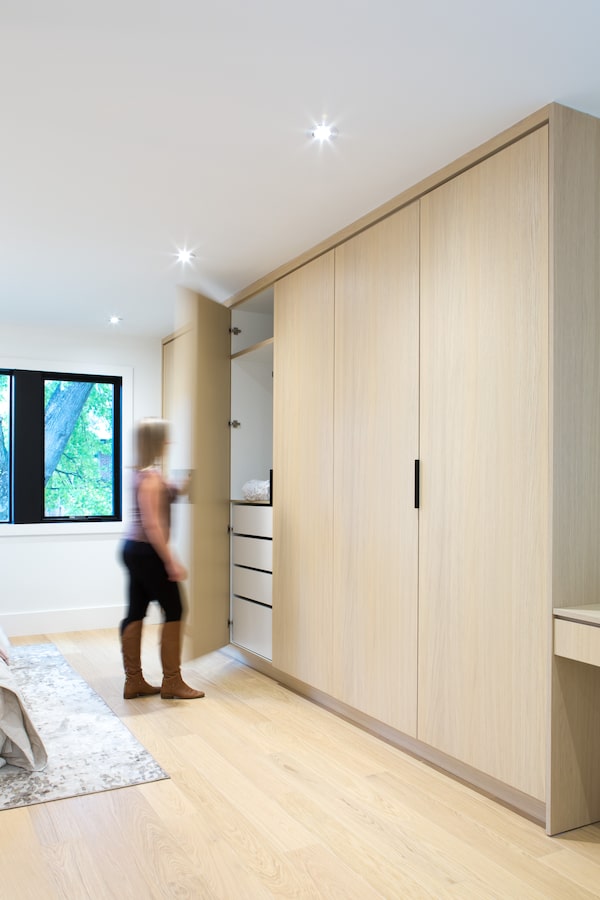
The linear wall of closets has built-in drawers.Yianni Tong Photography
Your house is your most valuable asset. We have a weekly Real Estate newsletter to help you stay on top of news on the housing market, mortgages, the latest closings and more. Sign up today.
 Carolyn Ireland