
The architect Louis Kahn, a master of postwar American modernism, famously distinguished between two kinds of institutional spaces: "servant" and "served." The servant spaces – stairwells, elevators, heating units – exist solely to support the higher order served spaces, such as offices, lecture halls or galleries. Mr. Kahn kept these quarters as separate as possible, so they wouldn't interfere with one another. His Richards Medical Research Laboratories at the University of Pennsylvania comprise three lab towers with plenty of windows and complex prismatic geometry. These buildings cluster around a plainer fourth, the institute's dark heart, which contains elevator banks, air ducts and mechanical systems.
The servant-served conceit forms the basis for the Opposite House, a residential project by Toronto architect Reza Aliabadi that evinces a deep commitment to modernist principles. Today, lifestyle magazines talk about "transitional" architecture, an aesthetic that borrows from modernism and older so-called traditional elements. Some architects do incredible work within this style, but in too many practices "transitional" seems like a euphemism for "unfocused" or "non-committal."

The front-facing ‘served’ half of Opposite House.
Borzu Talaie
Mr. Aliabadi, founder of the Toronto firm Atelier Reza Aliabadi, will never have this problem. He is a modernist in the truest sense of the word: an architect who likes simple concepts, sturdy forms and honest, unaccented materials. He owns a Jeep Wrangler – what he describes as a "box on wheels" – because what else would a modernist drive?
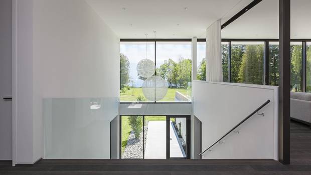
The Opposite House refigures Mr. Kahn's servant-served typology for a residential setting. The elongated bungalow consists of two rectangular forms. The front-facing rectangle (the "servant" space) is dark with few windows. It's clad mainly in grey Kolumba blocks from Petersen, which are handmade and two-and-a-half times longer than traditional bricks. The back-facing ("served") rectangle is clad in white stucco and adorned with a row of six-by-10-foot windows that look out toward the Scarborough Bluffs and Lake Ontario.

The main corridor runs between the ‘servant’ and ‘served’ blocks.
Borzu Talaie
The front entranceway leads immediately to the main corridor, a spine that runs between the servant and served blocks. This hallway is bookended by two lake-facing bedrooms: a master on the west end and a guest suite on the east. To the south, on the "served" side of the spine, sits the living room, the dining room and the kitchen, each generously lit and demarcated with partial divides. On the northern "servant" side, there are clearly partitioned spaces, including his-and-her bathrooms, walk-in closets and a large office, which suddenly became an additional bedroom when the clients, a married couple, discovered they were expecting.
Like the classic black-and-white cookie you find in Manhattan bakeries, the Opposite House derives elegance from juxtapositions: servant versus served, but also dark versus light and smooth versus rough. The material palette accentuates this yin-yang motif. The walls are art-gallery white, the floors are a dusky, chemically treated oak and the granite countertops evoke a grey and gravelly moonscape. The partial divides between the living spaces are thick enough to contain millwork or steel supports, and they demarcate rooms that seem at once closed and open. You're more likely to feel this juxtaposition than you are to notice it.
The house faces Lake Ontario.
Borzu Talaie
You will, however, notice the feature that Mr. Aliabadi calls the "agora": a tiered light well, adjacent to the living room, that steps down over a natural slope in the property. It's technically a staircase – overlaid, as it is, with hot-rolled metal steps leading to the basement – but it's suitably gracious for the "served" side of the home. Each tier is wide enough to sit on, and at the bottom are two lake-facing windows. A pair of lights by Bertjan Pot – orbs made from resin-drained yarn – hang dramatically in front of the glass.
Throughout the home, the clients set similarly tasteful furnishings, many of them modernist classics: Eero Saarinen's Pedestal Table, which resembles a drop of viscous liquid; Robert Haussmann's springy, cantilevered chairs, designed for the Paris Headquarters of UNESCO; and Ludwig Mies van der Rohe's beloved Barcelona Chair, originally made for the German Pavilion at Expo 1929. Each piece situates the house within a venerated tradition and shows the clients' aversion to flashy or self-consciously "design-y" products. "Anything that's too trendy," Mr. Aliabadi says, "automatically has a time stamp on it."

The living room, kitchen and dining room are separated by partial divides.
Borzu Talaie
The architect's commitment to modernism comes out most forcefully, though, not in the furnishings – or in the heavy massing, empty voids or pared-down colour scheme – but in the attention to detail. Modernism's best insight is that craftsmanship isn't the same thing as ornamentation. While earlier generations of builders indulged in decorative cornices and lavish entablature, modernists obsessed over structural elements that are so subtle as to be nearly invisible.
Because the home is elongated and flat, it called for thick steel reinforcements to keep the roof from collapsing. Mr. Aliabadi set many of these beams in the living room, just behind the comparatively thin window mullions but at enough of a remove that they're invisible from the outside. Instead of a mess of bulky supports, one sees a row of slim, identical mullions. The window overhangs are nearly a metre long: Just the right length to repel overbearing summer light and to bring the low-hanging winter sun deep into the home.
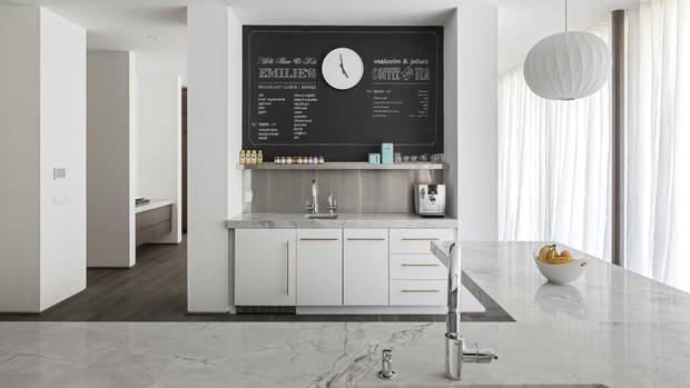
The kitchen of Opposite House.
Borzu Talaie
The architect also thought carefully about elevation. The house is mounted on a basement podium and the windows are inset from the main façade. Mr. Aliabadi set the floor at five feet, roughly eye level, so as to hide the appearance of depth. From the outside, the bottom window ledge appears not as a three-dimensional plane but as a clean, two-dimensional line. "It makes the structure feel lighter," Mr. Aliabadi says. "It helps you to understand the house as a floating volume."
When he explained this idea, we were at the back of the 82-metre-deep yard. Behind us were the bluffs, with their colourful striations of sediment. In front of us was the house itself, a monument to craftsmanship and structural rigour. In a project defined by juxtapositions, this final one – architectural precision versus rugged nature – was by far the most dramatic.